A mobile app designed for responders


Industry
Devtool, SaaS
Duration
2 months
Role
Lead designer
Team
2 designers, 1 pm, 2 engineers
The Rootly mobile app is THE place for on-call responders to manage their shifts and act on their alerts day-to-day. It was one of the most important products as it's deeply infused in responder's day-to-day workflow.
I single-handedly designed the app and the component library from 0 to 1, and kept iterating on additional features with the other designer.
Since this mobile app is often used by on-call responders during their most stressful moments — like waking up in the middle of the night or dealing with a SEV0 incident — I want to ensure our app delivers both delight and effortless usability to our users. Here's how:
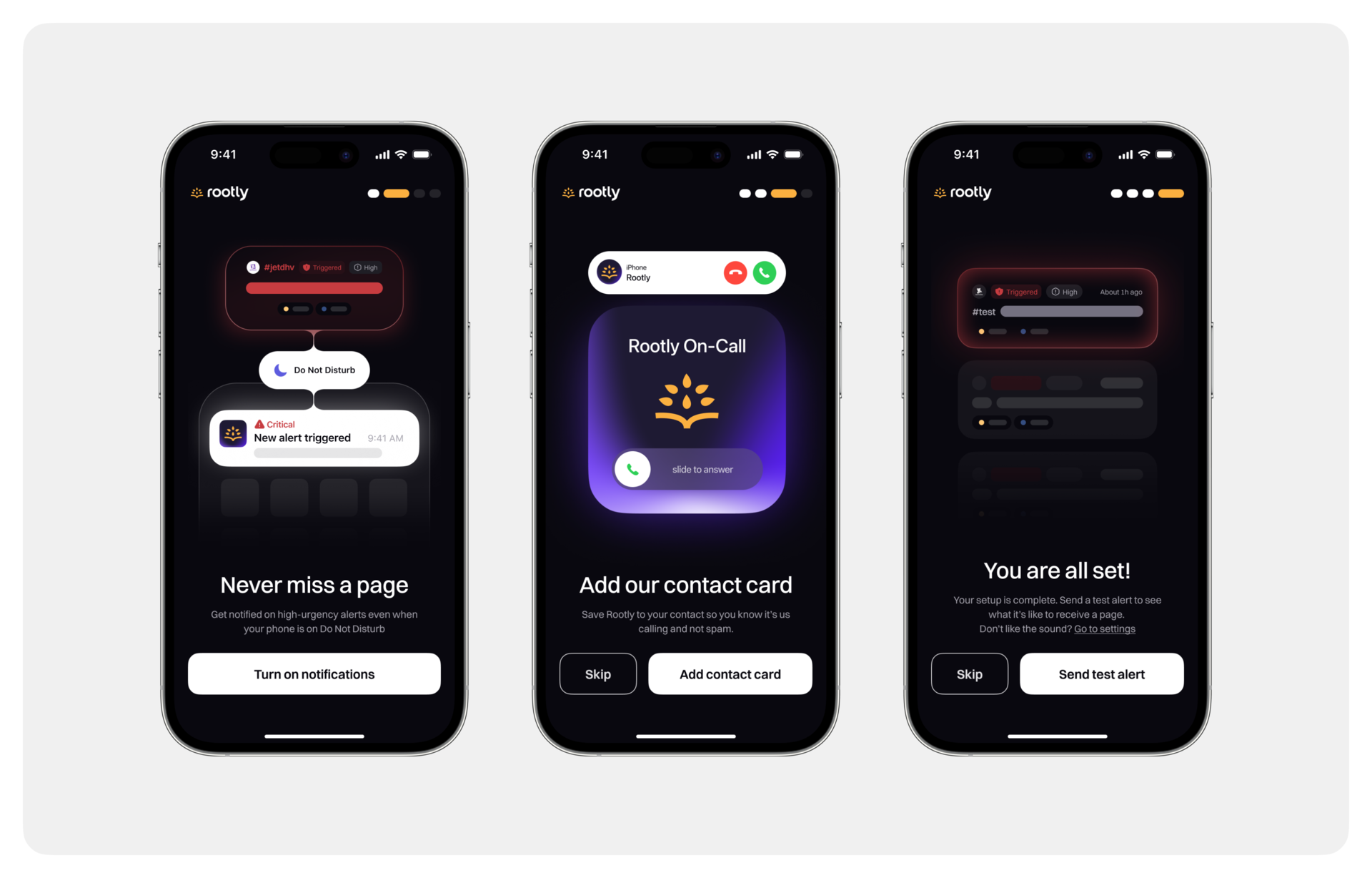
For user to receive alerts on our mobile app reliably, there are a few essential setups required. To achieve this, we focused on guiding users thoughtfully through the onboarding process, making sure they aren't overwhelmed by an extensive setup flow.
We poured a great deal of energy into designing an onboarding experience that feels engaging and approachable. Each screen is crafted to be both delightful and informative. We've also included a progress indicator at the top, so the process feels less daunting and more manageable.
By the end of the onboarding flow, users are fully prepared to use the app and primed to receive their very first alert.
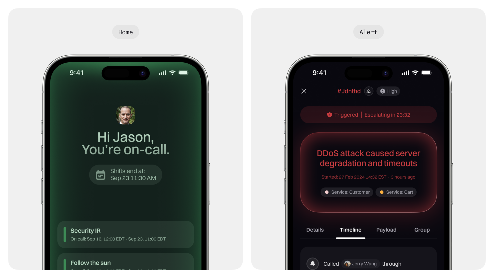
The key moments are the screens where user spend the most time on, or the crucial screen of a flow. I poured a lot of energy into refining these key moments to spark moments of joy for our users.
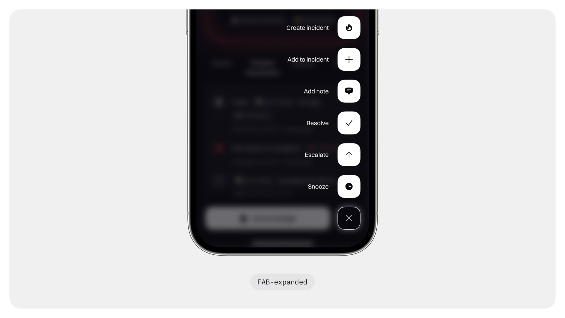
For example, I focused on the home page and the alert page, which are easily the most frequently visited pages.
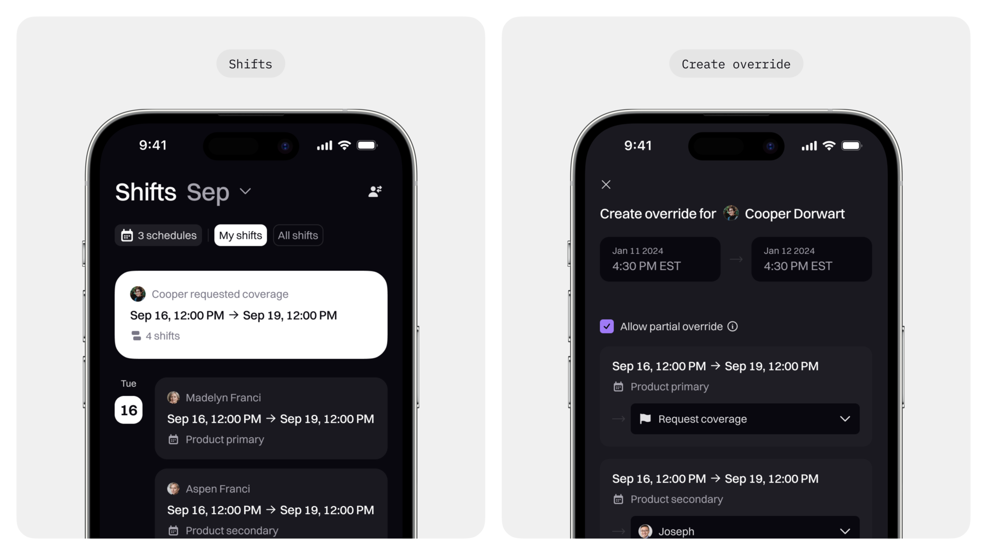
It’s the same story with the request coverage flow. Handling coverage requests from teammates can often feel tedious and time-consuming. So, we set out to make the experience more enjoyable and engaging. Inspired by the fun swipe interactions in apps like Bumble, Picnic, or even Slack, we developed a feature that lets users swipe left or right to accept or ignore coverage requests. This playful approach brings a sense of fun to the process, while still ensuring you get things done.
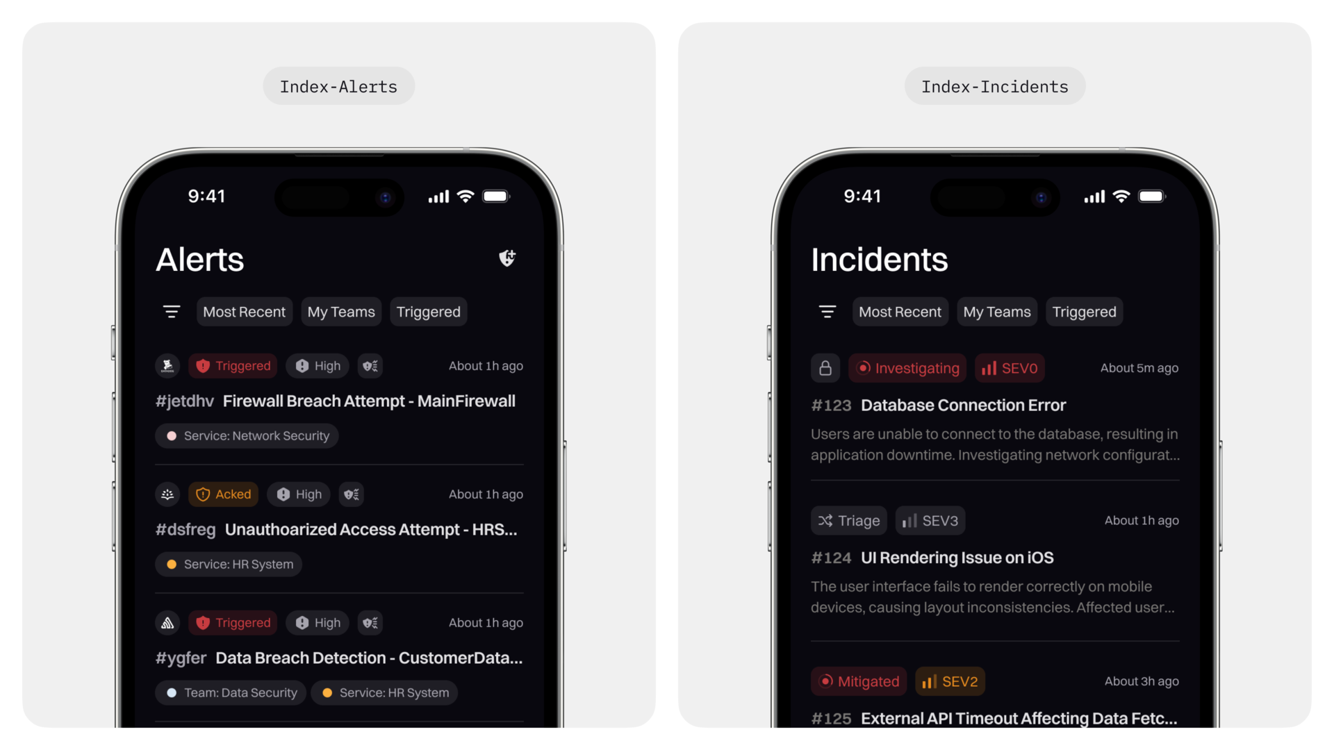
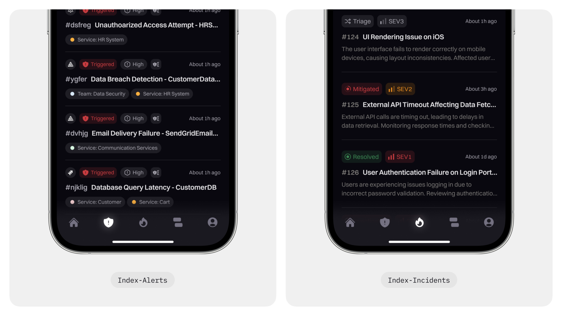
For index pages and utility pages, I want to minimize their cognitive load as much as possible. I introduced similar layouts and repetitive patterns, and gave them a simple and minimalist look, so that they are easy to navigate and intuitive to interact with.
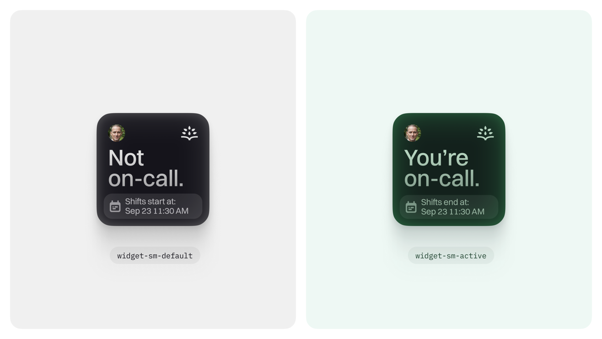
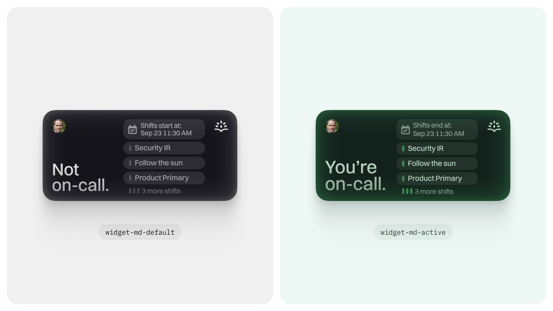
One significant addition is our mobile widget. This feature gives users an immediate, straightforward way to check their on-call status — so responders can tell at a glance whether they're on call or not. Tapping the widget leads them straight to the home page, strengthening that sense of continuity and cohesiveness between the widget and the full app experience.


Want to see all projects?
Check the ↳project index .